The Intake Form Builder lets you design branded, multi-step forms that collect exactly the information your firm needs.
Watch a Video
Build your form field by field with full control over its structure, then preview and publish it when you're ready to share.
Tip: Prefer a head start? AI can draft the first version of your form from a short prompt or an uploaded document. See Create an Intake Form Using AI.
Add a Form and Open the Builder
- From the left navigation panel, go to Intake > Forms.
- Click + Add Form in the top-right corner of the screen.
- In the pop-up, enter a Form Name, choose an Area of Law, and add a Description. All three fields are required.
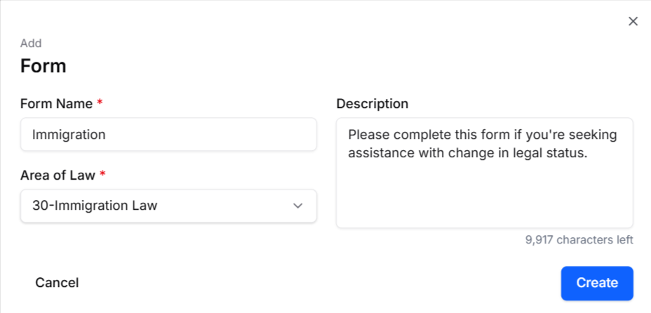
- Click Create. The new form opens in the builder.
Navigate the Builder
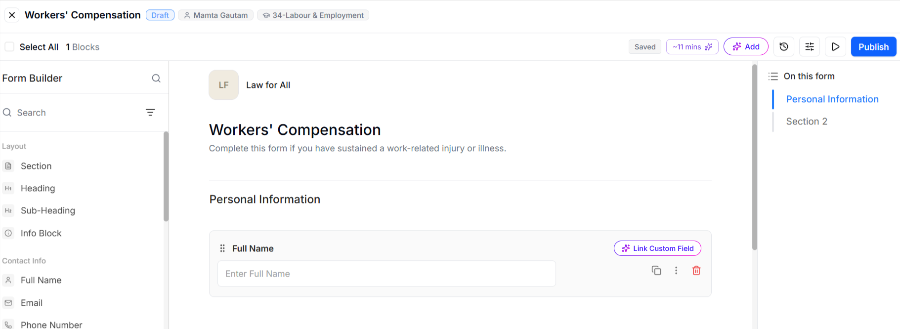
The builder has three main areas plus a toolbar:
- Field library (left) — lists every available field type, grouped by category.
- Canvas (center) — the form itself, where you add and arrange fields.
- Section navigator (right) — a jump-list of the form's sections. Click any section to jump to it on the canvas.
- Toolbar (top-right) — includes a live completion-time estimator plus the Create/Add with AI, History, Settings, Preview, and Publish buttons.
Add and Arrange Fields
To add a field to the form, do any of the following:
- Drag and drop a field from the field library onto the canvas — an indicator shows where it will land.
- Click a field in the field library to drop it in immediately.
- Hover between any fields on the canvas and click + Add Block to insert a new field.
The following field types are available:
| Category | Fields | Behaviour and Input |
| Layout | Section, Heading, Sub-heading, Info Block | Structure and display only — these organize the form and don’t collect any input from recipients. |
| Contact Info | Full Name, Email, Phone Number, Address | Capture standard contact details. |
| Choice | Single Choice, Multiple Choice, Dropdown, Toggle | Let recipients pick from options you define — a single answer, multiple answers, or an on/off toggle. |
| Date | Date, Time | Collect a calendar date or a time of day from a picker. |
| Other | Single-Line Input, Multi-Line Input, Number, File Upload | Free-form answers — short text, longer text, a number, or an uploaded file. |
Configure a Field
To configure a field, click it on the canvas to select it, then edit it right in place:
- Label — click the field's label text and type to rename it.
- Placeholder — click into the selected field's input area (if applicable) to type an example answer hint for recipients to see. You can also set a placeholder from Advanced Edit in the field's three-dot menu.
- AI Link to Custom Field — click the purple Link Custom Field label in the top-right corner of the field to have AI auto-map it to a system contact or custom field. See Manually Create an Intake Form Template below.
- Field actions — on the right, each field shows Duplicate, a three-dot menu, and Delete.
The field's three-dot menu contains:
- Required — makes the field mandatory. A red asterisk (*) is added to the field label, and recipients can't submit the form without completing it.
- Link to Custom/Default Field — manually map the field to a system contact or custom field.
- Advanced Edit — open additional field settings, such as placeholder text.
Configure Sections and Add Fields
Sections split up a form into a guided, multi-step experience for your recipients. If your form is blank and has no sections yet, the first field you add automatically creates a default first section.
To organize the form into sections:
- From the Layout category in the field library, click or drag a Section onto the canvas. Every field belongs to a section, and you can add as many sections as you need to organize the form.
- Sections are auto-named (Section 1, Section 2, and so on). To rename a section, double-click its label on the canvas, or click the pencil icon in the top-right corner of the section. Adding a Heading field inside a section also renames it — the section name updates to match the heading.
- Reorder a section by clicking the drag-and-drop handle to the left of its name and dragging it to another place on the canvas. Every field in the section moves with it.
- Use the On this form section navigator on the right side of the builder to jump to any section.
Each section also has controls that appear in its top-right corner when you hover over the section:
- Collapse — collapses the section and hides its fields to tidy your view.
- Edit (pencil) — edit the section name.
- Delete — remove the section and all fields inside it.
Note: Each section becomes its own page for recipients, with a progress bar and Next/Back buttons. Recipients can't advance until the required fields on the current page are completed. Empty sections stay visible to you in the builder but are hidden from recipients filling out the form.
To work with several fields at once:
- Hover over a field on the canvas and select the checkbox that appears to the left of its name. Select one or more fields to reveal the blue action banner at the top of the builder. To select every field on the form at once, click Select All in the top-left corner, above the field library.
- Choose a bulk action from the banner:
- Duplicate — creates a copy of the selected fields. Each copy is added within the same section, directly below the last available field.
- Move to — opens a Move to Section picker to move the selected fields into another section.
- Delete — deletes the fields from the form. Deleted fields cannot be restored.
- Cancel — clears your field selection.
Map Form Fields to Contact and Custom Fields
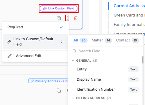
Mapping connects a form field to a system Contact or Custom field, so submitted answers flow to the right place in the application. To map a form field:
- To let AI map a field for you, click the purple Link Custom Field option at the top of the field.
AI picks the best match based on the label, for example, a "Full Name" field maps to "Contact – Name" — and only selects fields whose data type fits. - To map manually, open the field's three-dot menu and choose Link to Custom/Default Field.
- If mapping manually, use the picker to switch between All, Custom (Matter) Fields, and Contact Fields, or search for fields by name.
Each field shows a data-type badge, so you can link fields that match. If needed, you can add additional custom fields under Setup. - Click a field from the picker to map it. A blue badge appears on the form field to confirm the connection.
Refine the Form with AI Tools
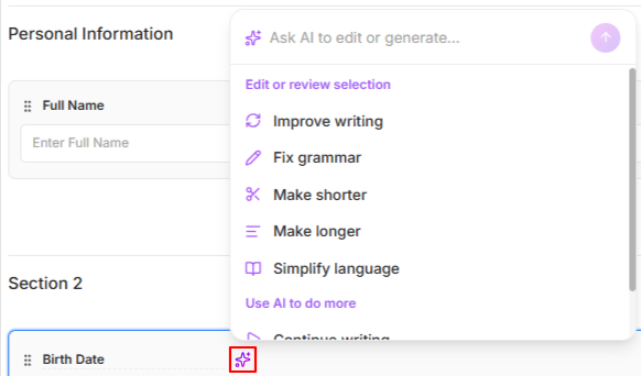
Two AI-powered tools help you refine the form as you build:
- AI Completion Estimator — the completion-time estimator in the top-right toolbar (next to Add with AI) predicts how long it will take a recipient to fill out and submit the form once you share it. It updates live as you add and remove fields, so you can gauge the effort you're asking of recipients and keep the form a reasonable length. The estimator automatically appears in the toolbar once fields have been added to the form.
- AI Language Polisher — while editing field labels and placeholder text, click the purple wand icon on the right to open the AI polisher. Type your own prompt or choose from options such as Improve writing, Fix grammar, Make shorter, Make longer, Simplify language, Continue writing, and Translate. AI displays suggestions based on your selected text, and you can accept, edit, retry, or dismiss each one.
Configure Form Branding and Publishing Settings
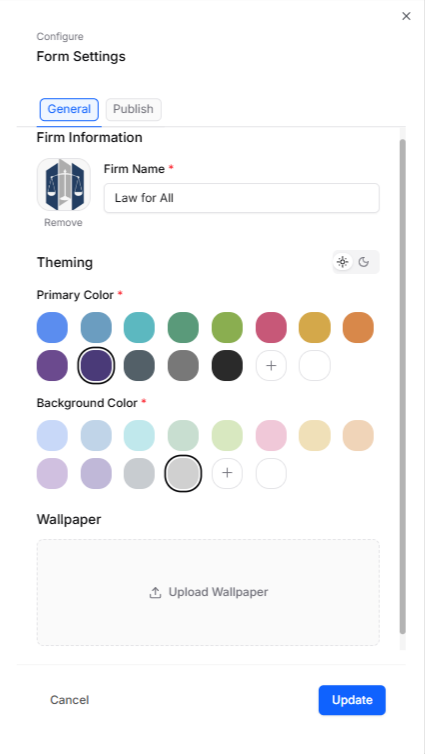
Form branding and publishing settings both live in the Form Settings pop-up. To configure the form's settings:
- Click the Settings button (sliders icon) in the top-right toolbar inside the builder. The pop-up has two tabs.
- On the General (Branding) tab, configure:
- Firm Name — the firm name shown at the very top of the form.
- Logo — click the logo square to upload an image (JPG or PNG). If you don't add one, the system uses the initials from the Firm Name as a placeholder logo.
- Primary and Background colors — pick from the available color swatches or add a custom color.
- Wallpaper — upload a background image for your form. An uploaded wallpaper overwrites any selected background color.
- On the Publish tab, configure:
- Expire — choose Never, or After a set number of days. The expiration applies based on when the form was sent to each recipient. For example, if a form is set to expire after 7 days, recipients can only access it during that 7-day window. If you don't set an expiration, the form won't expire.
- Notifications — select the NextGen user(s) who should be alerted when someone submits the form.
- Click Update to save changes to settings from both tabs.
Auto-Save and Version History
Your work saves automatically as you create and edit your form — look for the gray Saved indicator in the top-right builder toolbar, next to the AI tools. If you make a change before autosave kicks in, the indicator switches to Unsaved changes; click it to save on demand. Every save, automatic or manual, creates a version.
To restore a previous version of the form:
- Click History (the clock icon in the builder toolbar) to review a log of form changes grouped by date.
- From the Version History panel, select a previous form version.
- Click Restore Version. Restoring updates the current form to match the version you selected.
Preview and Publish the Form
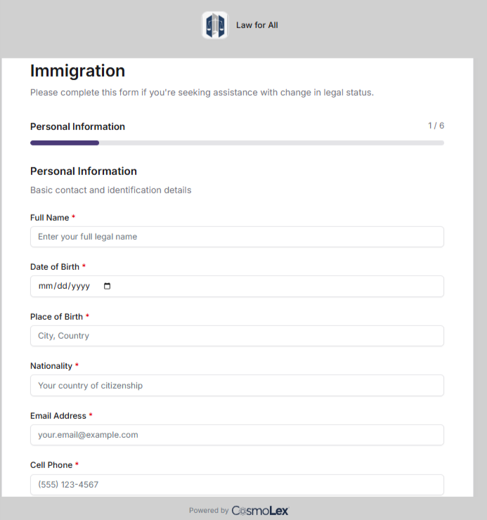
Preview lets you see the form exactly as a recipient will, before and after you publish it. To preview and publish the form:
- Click the Preview (play) button in the toolbar. Preview mode shows the form's sections as navigable pages, so you can review how the form will display to recipients.
- To exit preview and return to the builder, click Edit in the top-right corner.
- When the form is ready, click Publish in the builder toolbar. The form's status changes from Draft to Published, and it can now be sent and shared. See Send an Intake Form.